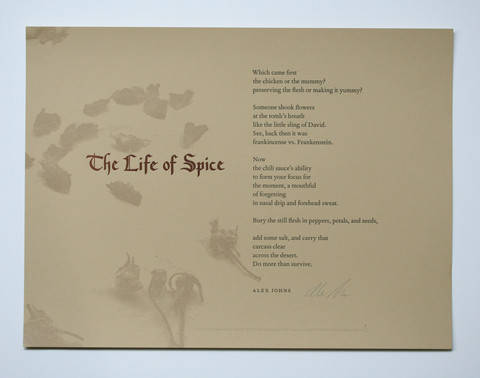
"The Life of Spice" (Alex Johns)
Which came first
the chicken or the mummy?
preserving the flesh or making it yummy?
Someone shook flowers
at the tomb's breath
like the little sling of David.
See, back then it was
frankincense vs. Frankenstein.
Now
the chili sauce's ability
to form your focus for
the moment, a mouthful
of forgetting
in nasal drip and forehead sweat.
Bury the still flesh
in peppers, petals, and seeds,
add some salt, and carry that
carcass clear
across the desert. Do more than survive.
"The Life of Spice" by Alex Johns and artwork / printing by Paul Moxon is the third in a series of current broadside collaborations between writers and artists at Smokey Road Press, Athens, Georgia. Fifteen poets have been paired with fifteen artists and each group was asked to create a letterpress-printed broadside. The resulting portfolio, No Small Measure, was organized by artist Margot Ecke, curator Beth Sale and poet Ezekiel Black.
Moxon, the illustrator and printer, selected the poem; more of his work can be seen at his website, fameorshame.com "I'm drawn to texts with a sense of place, that tells me something about the world and does it with wit," he observes to artist Margot Ecke. Here are further comments from Johns about the poem and the collaborative process, published online at the Smoky Road Press website.
There is a wonderful levity to this poem. How did the piece develop?
I wrote this poem quite a while ago, but I think it's indicative of a shift I was making in my approach toward playing with a voice that might seem initially disparate to the subject matter of the poem. I believe I was considering how close the relationship between food preservation and flavoring must have been to mummification and burial preparation in the ancient world, how living in a time in which death was more present, persistent, and "real" might have influenced the aspects of life and survival we take for granted (i.e. preparing and eating food).
Paul is a real master when it comes to typography. How do you feel about type choice and its relationship to how a text is understood? Did your understanding of typography change throughout this collaboration?
Paul chose the poem, and I was eager to see how he would bring color, image, and typeface into the experience. I like fonts, and I'm intrigued by the role of paper (its weight, color, texture, etc.) and the nuances of typeface in the experience of reading. I lack the vocabulary to articulate the aesthetic dimensions of this, but I am affected by it. I love that Paul chose tones evocative of earth, clay, and sand and such an intriguing font in an almost cinnamon color for the title. I'm not sure if he had this in mind, but the faded images of dried flowers seem to be tossed by the wind from a dusty desert floor. Paul's representation helps me to see the poem in a fresh way.


No comments:
Post a Comment